DDG search drop in powered by ddg.patdryburgh.com
tl;dr - Shorts introduction to pattern of styling components for use across projects with CSS Properties (AKA CSS Variables) and using a mix of BEM-style simple class hierarchies, and Tachyons-style general use classes where appropriate.
Recently I’ve been thinking a bit about the sad UI/UX state of affairs for one of my projects (it’s a job site for devs in tokyo @ techjobs.tokyo – and in general how I approach front end work. While the site certainly has some pretty underwhelming design and UI/UX right now, in my mind it represents an unfinished way of thinking regarding best practices I use on the front end. The TokyoTechJobs project gave me a good chance to actually try and approach my ideal frontend working conditions, including a split-off re-usable component library, and to explore the somewhat spread out workflow causes in practice (needing to make upstream changes, update dependencies, working with beta/bugfix branches, etc). In this article I’m going to write a little bit about where I think the field is going and how I plan to move with it.
I originally to write this article thanks to an awesome talk on combining CSS Grid and CSS Variables from JSConf US 2018. Recently I’ve been kicking the tires and trying out CSS Grid (CSS Grid Gardgen is an excellent gamified learning experience as well) and watching the talk reminded me of the fact that that CSS variables existed as the only real viable way (in my mind) to theme encapsulated components. Polymer’s styling system is the only real interoperable solution I’ve seen to this, and seeing that along with their general effort at staying spec-compliant was enough to mark Polymer as something worth trying down thte line eventually (Polymer 3 is a huge step forward).
Anyway as for the trends on how people are going to end up styling I’m thinking the following has the best chance of lasting:
.component .title { .... }).text-fg-primary and centered-text a lot in projects)Most of this is pretty obvious but I rarely see it written on the net these days that it’s ok to mix these approaches where necessary, most resources seem to make it an all-or-nothing endeavor.
Before I get too much farther I guess I should not that one pre-conception that I will share with most other writers out there is that the future (and past?) of the web/frontend development is componentized. Libraries like React, Vue, Polymer, and their ilk have overtaken libraries like Ember (which kept up by releasing Glimmer) and AngularJS because of the relative simplicity and component-based frameworks. As Web Components technology matures, I think the best way to unify all these approaches to components and achieve the holy grail of cross-framework, cross-site reusable components is by creating shims or being web component standards-compliant.
The approaches behind BEM, and Tachyons (and tons of other CSS methodologies) have been around long enough but the biggest problem to solve once these component frameworks broke onto the scene (using Shadow DOM to various degrees) was how to theme components properly – and CSS Variables is a pretty decent first step towards solving the problem. That said, another solution is CSS in JS (of React fame), but I’m not a fan of that at all – I think CSS gets worse the more we allow turing complete computation into it. I’m also somewhat out of the mainstream in that I prefer not to use pre-processors like LESS or SASS unless they’re required or have a very specific feature that I need. The biggest value-add for pre-processors in my mind was variables and with CSS variables they’re not really necessary (well unless you need to support IE, but I’ll touch on that later).
Since performing armchair architecture/design is lots of fun, I think it would be interesting to introduce a scheme or shared language for theming components, based on what comes up the most often. I’m proposing having two well-known groups of CSS variables:
Shared namespace
For example, values like this:
--theme-color-primary--theme-color-secondary--theme-font-size (and --theme-font-size-<tag>s as necessary)Component specific namespaces
Obviously component-specific namespacing is hard to do but generally most components are somewhat careful around name collisions (and usually if they collide by name it should be relatively unlikely they colide in other naming). The basic scheme would be to use a triple like --component-<some-component>-<some-specific-style-point> for most of the in-component styling.
I think using this basic naming scheme and maybe some shared resource/listing could enable us to get through roughly 80% of consistent styilng for components across libraries and projects. Of course, it’s madness to think that such a loose standard such as this would hold but crazier things have happened. At the very least it looks like people are clinging to Custom Properties as the styling API for web components, so using them more rather than less shouldn’t hurt.
Here’s an example using Mithril:
<!DOCTYPE html>
<html lang="en">
  <head>
    <meta charset="utf8">
    <title>Card Demo</title>

    <!-- Terrible, terrible inline styles, coupled with bad indenting -->
    <style>
     body, html {
       font-family: sans-serif;
       height: 100%;
     }

     body {
       background: #DDD;
       color: #333;
       display: flex;
       justify-content: center;
       align-items: center;
       align-items: center;
     }

     .centered-text { text-align: center; }

     /* Uncomment the lines below for override styling */
     /* :root {
        --theme-color-primary: #009462;
        --theme-color-primary-text: #009462;
        --theme-color-text-on-primary-text: white;
        --theme-color-secondary: gray;
        --theme-color-secondary-text: gray;
        --theme-color-text-on-secondary: black;

        --component-card-header-fg: white;
        --component-card-bg: #EEE;
        }
      */

     /* Pretend the stuff below is *inside* the component and obscured by Shadow DOM API, and not in this file
        One nice benefit of this approach is that it works in both situations --
        you can be dumb about how you include your CSS (not even using PostCSS or scoped CSS approaches) if you write your CSS this way. */
     .card-component {
       background-color: white;
       border-radius: var(--component-card-border-radius, .25em);

       box-shadow: 1px 5px 5px #888;
     }

     .card-component .header {
       padding: var(--component-card-header-padding, .5em);
       border-top-left-radius: var(--component-card-border-radius, .25em);
       border-top-right-radius: var(--component-card-border-radius, .25em);
       background-color: var(--theme-color-primary, black);
       color: var(--component-card-reader-fg, white);
     }

     .card-component .content {
       padding: 1.5em;
     }

     .card-component .footer {
       background-color: #FAFAFA;
       border-top-style: solid;
       border-top-width: 1px;
       border-top-color: #AAA;
       padding: .25em 0;

       border-bottom-left-radius: var(--component-card-border-radius, .25em);
       border-bottom-right-radius: var(--component-card-border-radius, .25em);

       display: flex;
       justify-content: space-around;
       align-items: center;
     }

     .card-component button.primary {
       background-color: var(--theme-color-primary, black);
       color: var(--theme-color-text-on-primary, white);
     }

     .card-component button.secondary {
       background-color: var(--theme-color-secondary, lightgray);
       color: var(--theme-color-text-on-secondary, black);
     }

     .card-component .footer button {
       width: 50%;
       color: white;
       border: none;
       border-radius: .25em;
       padding: .25em .5em;
       max-height: 3em;
       overflow: hidden;
       box-shadow: 1px 1px 1px #AAA;
     }

     .card-component .footer span.cancel {
       font-size: smaller;
     }

    </style>

  </head>
  <body>
    <script src="https://unpkg.com/mithril/mithril.js"></script>
    <script type="text/javascript">
     window.onload = function() {
       var root = document.body;

       var Card = {
         view: function(vnode) {
           const title = vnode.attrs.title || "Default Card Title";
           const content = vnode.attrs.content || "Some exciting content goes in here normally";

           return m("div", {class: "card-component"}, [
             m("div", {class: "header"}, title),
             m("p", {class: "content"}, content),
             m("div", {class: "footer"}, [
               m("button", {class:"primary"}, "OK"),
               m("span", {class:"secondary cancel"}, "Cancel"),
             ]),
           ]);
         }
       };

       var App = {
         view: function() {
           return m("main", [
             m("h1", "Card Demo"),
             m(Card)
           ]);
         }
       };

       // Try it out! This is just to
       // help get things started.
       m.mount(root, App);
     };
    </script>
  </body>
</html>
NOTE The code above is copy-pastable, you can run it in a CodePen or copy paste it into a .html file and view it in your browser and it will work. You can also check out the Gitlab Gist
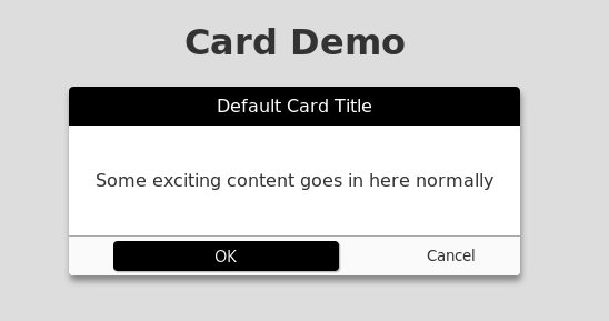
And here’s that exmaple rendered completely unstyled (as you might see on the preview page for the component):
And with the root styles uncommented:
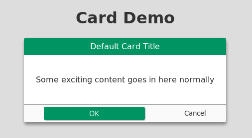
We’ve got some pretty simple (though it might not be easy at scale) styling implemented for this component. If we make the CSS variables we are using known through some other side channel (like the documentation of the component, or even automation), we can make it easy for people to discover a consistent way to apply external styling to the component without breaking Shadow DOM encapsulation (granted we’re not actually using shadow dom encapsulation in the example).
Obviously this isn’t a conclusive list but here are a couple things I thought might become an issue:
Obivously IE support is basically nonexistent for CSS Variables right now, and that’s very unfortunate. There are however some polyfills:
I personally think everyone should just start dropping browsers that lag behind but I also work in relatively green pastures most of the time, so obviously that’s an unreasonable stance to adopt. One of the silver linings to Chrome adoption progressing at an alarming rate is that more people will have and use an evergreen browser (even if it might be decimating privacy).
The obvious other big issue with this scheme is the likelihood of naming collisions and conflicts, and general bikeshedding around what to name certain variables in a way that everyone can understand them. I could imagine an endless amount of discussion taking place just to get new things added or things changed.
It was good to get my thoughts down on paper (so to speak), and I’m looking forward to writing some projects (and finding time to re-style and work on techjobs.tokyo) and get some more real-world experience with this approach and see if it will last. One thing I’ve also desperately wanted to do is to build a cross-library/framework component listing, sort of like webcomponents.org, but focus on showcasing interesting components that can be found in the various React/Vue/Mithril/etc ecosystems – having a consistent way to express styling would do wonders for being able to preview the component.