DDG search drop in powered by ddg.patdryburgh.com
tl;dr - I built mrman/landing-gear on GitLab, a repository full of lit (formerly lit-element) components that are packaged versions of the awesome components on wickedblocks.
Recently I came across some amazing F/OSS work done by WickedTemplates – WickedBlocks on Hacker News. WickedBlocks is a set of pre-made Tailwind CSS-powered components (“blocks”) that were open sourced by WickedTemplates. The blocks are really awesome, but one of the first things I thought was how much more awesome they’d be as easy-to-use web components. This also coincided with the time I was exploring SADE, a pattern for storing data in web components themselves. At the very least, having these blocks in an import-anywhere-and-use style would eliminate copy pasting tailwind-flavored HTML and move the problem to simply writing components into HTML (and feeding along attributes to control functionality).
I think native web components are the future, so another thing I’d really like is to have an excuse to try out some of the tools out there that build native web components (or can compile to them), in particular the minimal ones. I got a bunch of this writing the SADE post (I tried about 5 methods of making native web components) and landed on Lit-Element (now called “Lit”) as the best of breed in my opinion. It was the easiest to start with, the simplest (least precompilation/special file formats needed) and while it is off the beaten path (which might have drawn me to it), it’s very fast and concise. Just look at the performance that Lit-Element achieves. A close runner up was HyperApp but after taking a look it felt a little more unreliable with the ecosystem somewhat scattered.
While I’ve made component frameworks in the past (ex. maille), in between then and now the ecosystem has changed quite a lot. I don’t do a ton of frontend for most of my projects or clients so I have to take some time to reacclimate myself. A few things that have come up since I’ve been gone from frontend:
esbuildesbuild is a new blazing fast bundler that has come out of Golang land – the main thrust is that you can compile javascript much faster by not compiling javascript with javascript but instead using Golang and skipping some of the more thorough type checking done with TS (since tsc can still do that, with --noEmit). This feels like a great fit for my build tooling, but it’s an interesting choice because it doesn’t have much of an ecosystem around it just yet (well it hasn’t had much time) and is a somewhat “lower level” tool – other frameworks are using it for builds and doing other things on top.
viteA bit higher level on the abstraction chain is vite, a new build tool to rival Metal GearWebpack. Vite was created and is maintained by the team behind Vue, who have created what I think is the best power/complexity component framework out there, especially in the React-like space. Vite uses esbuild (previously optional) as well to speed things up, but the way it works is quite different, leveraging ES Modules (“ESM”) and some more tricks to make things build fast. As usual with high quality projects there is a Why Vite rationale page and a comparison to other tools page.
The SvelteKit team moved to Vite which is a pretty hearty recommendation in my mind. Since SvelteKit is something I’m watching and waiting on, investing in learning and understanding Vite also is likely to pay dividends if/when I use more Svelte.
lernaWhile working on maille I used Parcel v1 in anger to compile all the components and spit out browser-ready JS, but that is generally not industry best practice. While I’m not going to bow to industry and choose Webpack or Rollup this time, what I do want to adopt is the use of a multi-package-repo management tool. There are a few out there:
PNPM seems to be the newest comer to the group and is already being used by quite a large group of major companies. While I’ve presented the above things as substitutes, they’re not really, and even when they are it’s not quite clear which part of the stack they could substitute:
pnpm is often considered a replacement to npm and yarn just as much as lerna. pnpm is very much focused on making package installation much more efficient by using hard links and symlinks appropriately, but it also ends up having some features that are attributed to lerna as well. It might have been the right choice for this project as well, but I figured yarn (which I already know and love) in addition to lerna was enough innovation tokens spent.
If it wasn’t clear – I’m picking lerna + yarn (+/- workspaces interop) in the build/publish-time package management arena.
So writing the first component was actually a big pain, because I went through a series of steps that all lead me to one problem:
lit-element-starter-ts but felt it was a bit too prescriptive and had Big G copyright assignments everywhere (and the repository was CLA’d which I’m not a fan of)vite, but couldn’t get the tailwind styles to compile properlyesbuild
At the end of the day (literally), the problem was that Shadow DOM was doing it’s job and keeping TailwindCSS styling from affecting the lit component! Lit just doesn’t seem to have a good solution right now for this kind of thing, really. I even tried some Tailwind-via-CSS-in-JS solutions like twind, but to no avail. In general it might be a good to disable the Shadow DOM CSS isolation feature here since people could want to customize their tailwind installations outside of what I have when they deploy (and have those styles affect the component) but it’s not a decision i sat down and made, more one that I have sort of backed into.
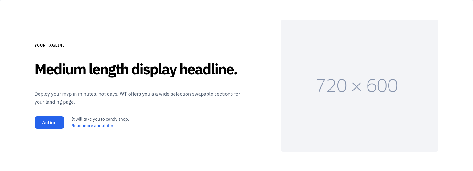
<lg-left-header>After getting through the jungle of building the actual code, once I was free to build the actual components the first component I focused on was <left-header> - an amalgamation that would combine all the different-but-similar left headers listed on wickedblocks. A lot of the left headers there were similar, for example take a look at this one:
Compared to:
The differences between these two can be summed up:
These could be the same component, with different options specified and I intend to make it so!
<lg-left-header>Well needless to say, I got it done (which is why this post exists) – here’s what the minimal HTML looks like:
<!DOCTYPE html>
<html lang="en">
  <head>
    <script type="module" src="/src/lg-left-header.ts"></script>
  </head>
  <body>
      <lg-left-header ></lg-left-header>
  </body>
</html>
Completely stock, I fill in the title and other things, but you still get a functional component. It looks like this:
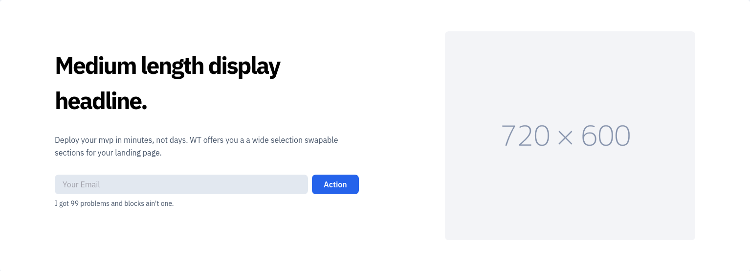
What about the second variant, with the email form? Well the HTML looks like this:
      <lg-left-header variant="email-and-action-button"
                      title="This is the title of the 'email-and-action' variant"
                      main-text="It's got some main-text to go along with the title, right before the email input itself"
                      below-email-blurb="This blurb goes right below the email address input"
                      action-button-text="Sign up"></lg-left-header>
And the component renders like this:
<lg-left-header>And finally here’s the nitty gritty on the “backend” of that HTML (well the structure of the code):
import { LitElement, html, css, unsafeCSS } from "lit"
import { customElement, property, query } from "lit/decorators.js";
import tailwindStyles from "./tailwind-styles.generated.css.text?raw";

export enum LGLeftHeaderVariant {
  ActionButtonAndDescription = "action-button-and-description",
  EmailAndActionButton = "email-and-action-button",
  FourLogos = "four-logos",
  ThreeItemChecklist = "three-item-checklist",
  TwoCard = "two-card",
}

/**
 * Left Header
 * See: https://blocks.wickedtemplates.com/left-headers
 *
 *
 * @cssprop --action-button-bg-color - The background color of the action button
 * @cssprop --action-button-fg-color - The foreground (text) color of the action button
 *
 * @csspart container
 */
@customElement("lg-left-header")
export class LGLeftHeader extends LitElement {
  static styles = css`
  /* Tailwind styles */
  ${unsafeCSS(tailwindStyles)}

  /* Component styling */
  :host {
    display: block;
  }

  button.action {
    background-color: var(--action-button-bg-color, rgba(37, 99, 235, var(--tw-bg-opacity)));
    color: var(--action-button-fg-color, rgba(255, 255, 255, var(--tw-text-opacity)));
  }
  `;

  ///////////////////////
  // Shared properties //
  ///////////////////////

  @property({ type: LGLeftHeaderVariant })
  variant = LGLeftHeaderVariant.ActionButtonAndDescription;

  @property()
  title = "Medium length display headline";

  @property()
  tagline = "Your tagline";

  @property({ attribute: "main-text" })
  mainText = "Deploy your mvp in minutes, not days. WT offers you a a wide selection swapable sections for your landing page.";

  // elided: more properties for this variant ...

  ////////////////
  // Four Logos //
  ////////////////

  @property({ attribute: "logo-1-alt" })
  logo1Alt = "";
  @property({ attribute: "logo-1-width", type: Number })
  logo1Width = 42;
  @property({ attribute: "logo-1-height", type: Number })
  logo1Height = 42;
  @property({ attribute: "logo-1-src" })
  logo1Src = "";

  // elided: more properties for this variant ...

  // render function for this variant
  protected fourLogosHTML() {
        return html`
<section class="text-blueGray-700 ">
  <div class="container flex flex-col items-center px-5 py-16 mx-auto md:flex-row lg:px-28">
    <div class="flex flex-col items-start w-full pt-0 mb-16 text-left lg:flex-grow md:w-1/2 xl:mr-10 md:pr-12 md:mb-0 ">
      <h1 class="mb-8 text-2xl font-bold tracking-tighter text-left text-black lg:text-2xl title-font">${this.title}</h1>
      <p class="mb-8 text-base leading-relaxed text-left text-blueGray-700">${this.mainText}</p>
      <div class="flex flex-wrap w-full mt-2 -mx-4 text-left ">
        <div class="w-1/4 p-4 mt-4 sm:w-1/4">
          <img width="${this.logo1Width}" height="${this.logo1Height}" alt="${this.logo1Alt}" src="${this.logo1Src}"/>
        </div>
        <div class="w-1/4 p-4 mt-4 sm:w-1/4">
          <img width="${this.logo2Width}" height="${this.logo2Height}" alt="${this.logo2Alt}" src="${this.logo2Src}"/>
        </div>
        <div class="w-1/4 p-4 mt-4 sm:w-1/4">
          <img width="${this.logo3Width}" height="${this.logo3Height}" alt="${this.logo3Alt}" src="${this.logo3Src}"/>
        </div>
        <div class="w-1/4 p-4 mt-4 sm:w-1/4">
          <img width="${this.logo4Width}" height="${this.logo4Height}" alt="${this.logo4Alt}" src="${this.logo4Src}"/>
        </div>
      </div>
    </div>
    <div class="w-5/6 lg:max-w-lg lg:w-full md:w-1/2">
      <img class="object-cover object-center rounded-lg " alt="${this.rhsImageAlt}" src="${this.rhsImageSrc}">
    </div>
  </div>
</section>
    `;
  }

  //////////////////////////
  // Three Item Checklist //
  //////////////////////////

  // elided: more properties for this variant...

  // elided: render function for this variant...

  /////////////////////////////
  // Email and Action Button //
  /////////////////////////////

  // elided: more properties for this variant...

  // elided: render function for this variant...

  //////////////
  // Two Card //
  //////////////

  // elided: more properties for this variant...

  // elided: render function for this variant...

  ///////////////////////////////////
  // Action button and description //
  ///////////////////////////////////

  // elided: render function for this commonly reused chunk of HTML...


  ///////////////
  // Rendering //
  ///////////////

  render() {
    switch (this.variant) {
      case LGLeftHeaderVariant.FourLogos: return this.fourLogosHTML();
      case LGLeftHeaderVariant.ThreeItemChecklist: return this.threeItemChecklistHTML();
      case LGLeftHeaderVariant.TwoCard: return this.twoCardHTML();
      case LGLeftHeaderVariant.EmailAndActionButton: return this.emailAndActionButtonHTML();
      case LGLeftHeaderVariant.ActionButtonAndDescription:
      default:
        return this.ActionButtonAndDescriptionHTML();
    }
  }

  private _handleActionClick() {
    const event = new Event("action-clicked", {bubbles: true, composed: true});
    this.dispatchEvent(event);
  }
}

declare global {
  interface HTMLElementTagNameMap {
    "lg-left-header": LGLeftHeader
  }
}
And the directory tree around that one component:
mrman 15:46:07 [landing-gear] $ tree -I node_modules lg-left-header
lg-left-header
├── custom-modules.d.ts
├── custom-modules.d.ts~
├── dist
│   ├── dummy-image-720x600-gray.png
│   ├── firefox-logo.svg
│   ├── index.html~
│   ├── lg-left-header.es.js
│   ├── lit-logo.svg
│   ├── vite-logo.svg
│   └── yarn-logo.svg
├── index.html
├── Makefile
├── package.json
├── postcss.config.js
├── node_modules
│   └── < elided >
├── public
│   ├── dummy-image-720x600-gray.png
│   ├── firefox-logo.svg
│   ├── index.html~
│   ├── lit-logo.svg
│   ├── vite-logo.svg
│   └── yarn-logo.svg
├── rollup.config.js~
├── src
│   ├── favicon.svg
│   ├── lg-left-header.ts
│   ├── lg-left-header.ts~
│   ├── styles.css~
│   ├── tailwind-styles.generated.css.text
│   └── vite-env.d.ts
├── tailwind.config.js
├── tsconfig.json
├── types
│   ├── left-header.d.ts
│   └── lg-left-header.d.ts
├── vite.config.ts
├── yarn-error.log
└── yarn.lock

4 directories, 33 files
tailbuild/tailwindcssWhile I like the flexibility tailwind provides, dealing with building in the tailwind styles is a bit annoying. I don’t really need PostCSS or any of the associated machinery, all I really want is the styling that other people have come to use and depend on that comes bundled with Tailwind. If Tailwind was split up into parts and I could include just the bits I needed without the build-time rigamarole I’d do that (and eat the performance penalty) but importing all of Tailwind (and not tree-shaking at all) is too much.
The idea of serializing the Tailwind styles to plain CSS and then inserting CSS variables where necssary is really appealing to me because it lends itself to maintaining the Shadow DOM isolation (which is great for consistency), and allowing for structured changing of the styling of the components. if I do it right I can even have cross-component changes with properly planned variables and that’s much more compelling for simple use cases than “go and change how you compiled tailwind” and import that, or having the danger of CSS changes outside the components affecting them.
Enter tailbuild – a reddit thread I came across while searching for a tailwind-to-css converter (I even came across a blog from someone moving from Tailwind to CSS Variables!) introduced it and it looks like exactly what I want. To be fair this functionality looks like it’s bundled Tailwind itself via Tailwind’s CLI, but Tailwind is not very forthcoming about how it looks through the HTML and CSS to find classes that it should include when processing for the purge option. It’s not clear to me what tailbuild will do compared to a properly configured tailwind.config.js so it looks like I’ll have to do some digging!
…Or not – a quick look at the code for tailbuild exposes that it’s the same as doing a purge enabled build, but a bit more advanced – it uses the jit mode (I’m not sure if this is implied by using purge in recent versions of Tailwind):
function getConfig() {
    if (args['--config']) return args['--config']

    if (fs.existsSync('tailwind.config.js')) return 'tailwind.config.js'

    return {
        mode: 'jit',
        purge: referenceFiles,
    }
}
As you can imagine, the referenceFiles are essentially ferried through (you provide them). Looks like for my project I should go with a properly configured per-component tailwind.config.js file, and I should be able to get the same results, without running tailbuild (though tailbuild is a cool tool, extracting this useful functionality). Someone does need to productize tailbuild though, just like the tailwind converter – I want something that spits out CSS for some HTML that contains tailwind. It probably could run completely in the browser as well…
While this worked relatively reasonably, it turns out it’s easy to just… call tailwindcss and get the same result, so I added it to my package.json:
  "scripts": {
    "dev": "vite",
    "css": "npx tailwindcss --jit --config tailwind.config.js --output src/tailwind-styles.generated.css.text",
    "css:watch": "npx tailwindcss --watch --jit --config tailwind.config.js --output src/tailwind-styles.generated.css.text",
    "build": "tsc && vite build",
Doesn’t get much easier than that, super glad that TailwindCSS has embraced this paradigm rather than trying to force SASS/LESS/Stylus/Emotion/whatever else on everyone.
In this day and age, planning for I18N and L10N should be done right at the beginning – it’s easier to do it now than it’s ever been with support even in the ECMAScript standard and resultingly built into “modern” browsers.
lit/localizeSince I’m using Lit, the obviously fix for this is to use the localize package, but it’s currently an “Active work in progress”! It uses the XLIFF localization interchange format which is awesome, but maybe it’s not such a great idea to depend on it just yet. It’s got all the things I think I need, but maybe just making sure that all the text is properly templated is enough for now. Simple templating can pass for good enough i18n/l10n in a pinch, so I’ll leave it there.
It’s good if the CSS is preshaped (thanks to wickedblocks) but we also want it to be easy to change some things, like the color of the button or text, within reason. CSS variables could make this really easy to configure, so some knobs there have been included. It’s hard to know whether there are enough knobs and if they’re of the right size (so to speak) but that will become well known with use.
I’ve already discussed this quite a bit, but I think the more crafted response is appropriate here – while wickedblocks chooses Tailwind, I just want the styles and the consumers that use landing-gear will want the minimal set of styles along with the ability to change just what they want to and no more (which is a bit of a moving target). To accomplish that I think it makes sense for me to:
This is a bit more work for me, but I think it will be much easier and more accessible for users of the components library. See the end of the tailbuild section to see how the implementation went!
This is the thorniest tihng so far – interaction and events are obviously very important on a landing page! Using native web components is great and all, but wiring together these components to interact is pretty important, especially fi we want to de-duplicate functionality. Being able to trigger common actions without having to write the code yourself multiplies the utility of landing-gear and makes it something worth using.
landing-gear just isn’t enough to accomplish what you’d want out of a full interactive landing page, assuming you’re not using something like TypeForm in addition. Luckily for me, figuring out a way to do this in a pure-component world is something I’ve spent some time thinking about before (the SADE pattern). I think sprinkling a little bit of that approach might be a good idea here, and a good way to see just how useful it is to users in the wild.
So let’s think about some of the shared functionality I shoudl consider integrating up front:
<scroll-service>Doing things based on scroll behavior is important for at the very least the navigation bar (if it’s sticky/floating) so I it’s worth having a scroll service there. This could also be used by others if they simply hook into it from the javascript side, which is very very unlikely, but possible.
<intersection-observer-service>Intersection observing is a really useful feature. Exposing it to users of landing-gear would mean that people could easily write CSS that targeted those intersections and that’s very useful.
<i18n>Earlier I noted that it was fine to mostly control/deal with i18n by just ensuring that all the text that showed up was templated out/insertable, but maybe it makes sense to take this one step further and allow a mode where the i18n service is used instead of the templated text. I think if the <i18n> component is built right, we can have XLIFF fed straight into it like this:
<sade>
<i18n>
<xliff>
<trans-unit id="h3c44aff2d5f5ef6b">
<source>Hello <ph id="0"><b></ph>World<ph id="1"></b></ph>!</source>
<!-- target tag added by your localization process -->
<target>Hola <ph id="0"><b></ph>Mundo<ph id="1"></b></ph>!</target>
</trans-unit>
</xliff>
</i18n>
</sade>
While XLIFF might not be the right tool here, regardless of how it’s structured the i18n could be loaded for different pages right from the markup of the page which would be much easier for non-technical people to manage/contribute to.
<kv-store>Since reactivity is important at the end of the day, when landing pages is actually used a simple page-wide kv-store is probably appropriate to save some information long term that affects more than one component. Lit-element does have some solutions in this field so it’s worth looking into to see whether they can solve my problems.
Since lit-element really only provides you reactivity once a variable is fed into your component, it looks like <kv-store> (and the SADE pattern for data management in general) still has a place to occupy.
<event-bus>Being able to listen and react on events that happen in one component from another is definitely a nice to have and crucial in some places where normal event bubbling isn’t ideal. While event buses can turn to mesys spaghetti really really quickly, they’re the simplest implementation of message bussing, and are a good first step in the right direction.
<plans-service>This is a bit more specific to my plans on using landing-gear (to develop landing pages), but the idea of a service that holds informations about the plans and pricing for the products for sale on the landing page seem like something that’s common enough to be worth trying to standardize. Generally all landing panges need to define pricing information, and to enable flexibility they usually end up being able to take them from some API endpoint.
Where features and other details of the product seem not too difficult to write by hand per-project, pricing feels like something you’d want to define on the backend (and have it be the source of truth) and just expose to the frontend. One thing about doing this as a component that’s nice is that we can actually hard code the data as well – there’s no need to fetch the data if it can be hard coded on the frontend (for example landing pages that only collect emails pre-launch).
Hopefully you find as much utility in landing-gear as I had fun writing it! All of it was made possible by the wickedblocks project (sponsored/created by wickedtemplates) so make sure to give them a look as well.