DDG search drop in powered by ddg.patdryburgh.com
tl;dr - Wrap your robust ThingService/ThingStore in a web component and adhere to a minimal API so you can reuse them with greater ease. View the Demo or check out the code in the Gitlab Repo.
I’ve been spending a lot of my time lately working on a product (yet to be released) for making SaaS companies and startups in general easier to launch (I’m talking like 0 to landing + client portal + charge a paying customer via Stripe and issue an API key in 5 minutes, with no code). Along the way one thing I’ve been tossing about in my head that is tangentially related is how to make simple webpages (like landing pages) easier and quicker to develop.
Fellow consultants and in general experienced engineers have seen it play out tens of times – startups build landing pages, front and back-office admin pages, and interfaces that are jarringly simliar, and I find that the startups and midsize companies I work with are no different and I can easily recognize the repetition. It seems like we’ve all but solved the problem of making UI component reusable, there are tens of component libraries out there, frameworks for making component libraries visible, and lots more. But when you pull these libraries in, you still have to do the data plumbing yourself – setting up your Redux store or Angular Services or whatever you’re using to shuffle data from backend to front – is there a faster way, at least in the simpler cases?
Before I jump in I want to lay out my historical view on web’s component trend that shapes my views:
This leads me to this idea: frontend development would be easier/quicker if both components and data were similarly easy to reuse, enabling only HTML/CSS in the simplest use cases. We can’t quite get to this idea in reality right now because we don’t have a way to share data/functionality across the native web components we might import from various sources. If you use a Vue native web component and a Svelte native web component on the same page, there’s no good way (that I know of) to ferry data between them.
In fact in general there’s no good way to ferry data between web components at all, really. We know the data we want is somewhere in the local space (or even attached to the elements we care about), but we can’t get at it. Well, what if we created little repositories (stores, for example) to hold the data, and made them web components? That’s the idea I’m trying to introduce here.
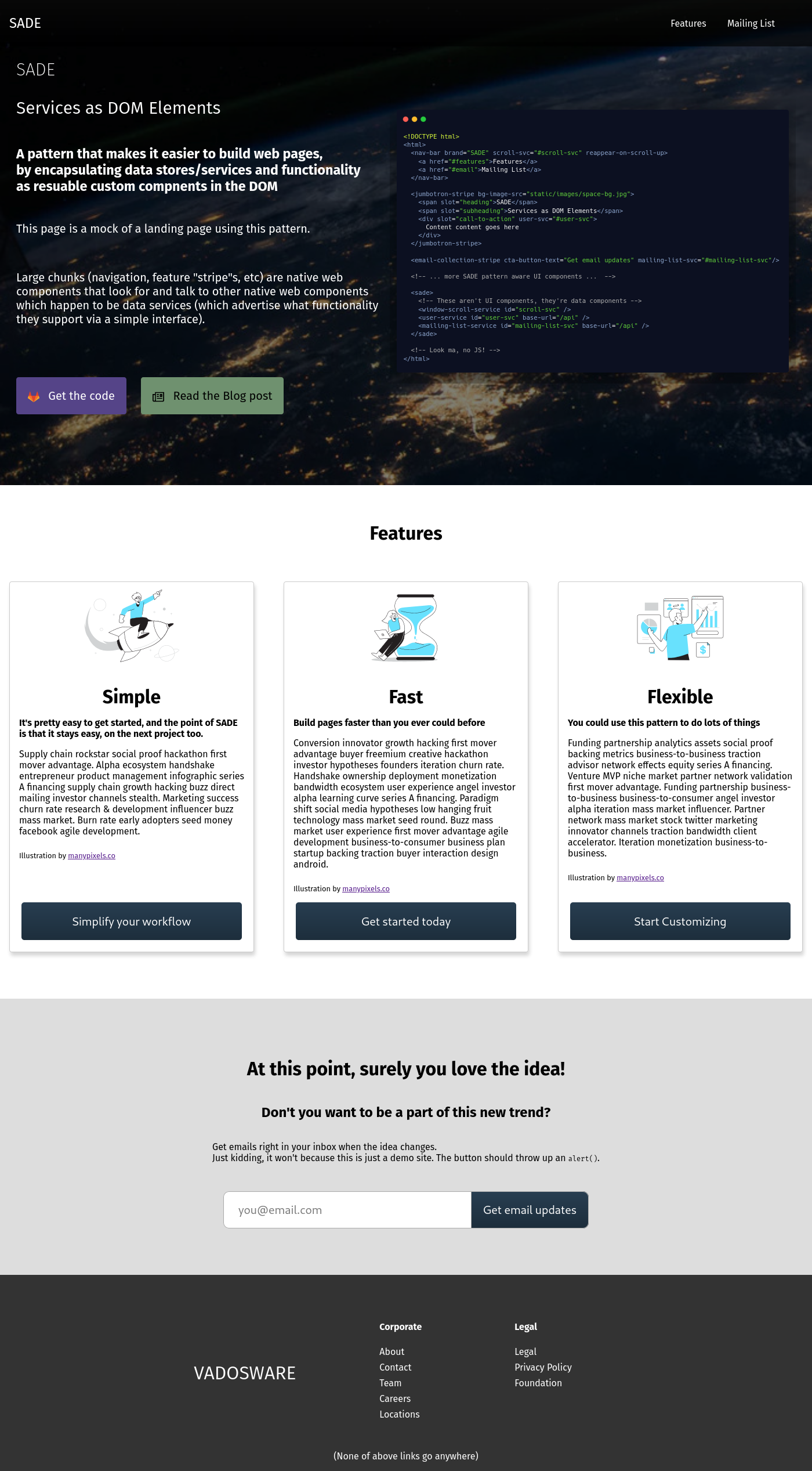
To get to my point a little quicker – I want to be able to write only the following HTML/CSS to get a functioning “tiger tail” style landing page:
<!DOCTYPE html>
<html>
  <head>
    <title>SADE Example</title>
    <script type="module" src="navbar.js"></script>
  </head>
  <body>

    <nav-bar brand="SADE" scroll-svc="#scroll-svc" reappear-on-scroll-up>
      <a href="#features">Features</a>
      <a href="#email">Mailing List</a>
    </nav-bar>

    <jumbotron-stripe centered bg-img-src="./some-picture-from-unsplash.jpg">
      <heading>SADE</heading>
      <subheading>Services as DOM Elements</subheading>
      <call-to-action user-svc="#user-svc">
        <text>Services as DOM Elements</text>
        <button-text>Become a true believer</button-text>
      </call-to-action>
    </jumbotron-stripe>

    <feature-stripe>
      <featurette-card>
        <heading>Simple</header>
        <blurb>It's pretty simple</blurb>
      </featurette>

      <featurette-card>
        <heading>Fast</header>
        <blurb>Build pages faster than you ever could before</blurb>
      </featurette>

      <featurette-card>
        <heading>Flexible</header>
        <blurb>You could use this pattern to do lots of things</blurb>
      </featurette>
    </feature-stripe>

    <email-collection-stripe mailing-list-svc="#mailing-list-svc">
      <heading>At this point, surely you love the idea</heading>
      <input-prompt>Don't you want to be a part of this new trend?</input-prompt>
      <button-text>Join our mailing list</button-text>
    </email-collection-stripe>

    <brand-footer>
      <company-name>Vadosware</company-name>
    </brand-footer>

    <sade>
      <window-scroll-service id="scroll-svc" />

      <user-service
        id="user-svc"
        base-url="/api/v1/users" />

      <mailing-list-service
        id="mailing-list-svc"
        base-url="/api/v1/mailing-lists" />

    </sade>

  </body>
</html>
To see what this actually ended up looking like you can check
src/index.htmlin the codeIt’s not this streamlined (since I did have to write some real HTML to get things to display nicely) but it is custom glue JS free
I’m not sure what this is called by others but I often refer it to as the “tiger tail” style page – The big jumbotron striope with following horizontal stripes of sections with information about the product below. There are a few custom components in here, and because of how prevalent the tiger tail style page is you can imagine what they are just from the markup:
<nav-bar> - a nice minimal navigation bar<jumbotron-stripe> - a large image background section with some sparse text<feature-stripe> - a horizontal stripe of the page that contains some information<email-collection-stripe> - Allow people who are interested to sign up for a mailing list<brand-footer> - The footer of the page with various linksThere are a few that aren’t so easily guessable which are the focus of this post:
<sade><user-service><mailing-list-service>This second set of components represent functionality that powers the components above them, with the references scattered around. For example you can imagine that the <email-collection-stripe> component takes the string mailing-list-svc, and uses it in a document.querySelector() call to find the DOM element that is the mailing-list-service and interacts with it. What should that dom element look like?
SADE services have a very simple contract:
interface SADEService extends HTMLElement {
  // Check whether the SADEService adheres to a given API, expressed as a URI
  supports(uri: string): Promise<boolean>;
}
It is up to components to encode how to use one or more services, and to include that code so that they can be used with the existing elements that offer that interface. Some custom element <x> is programmed to check a referenced SADE-compliant service that supports("urn:domain.com:services:user:v1"), where the URI points to a set of functionality determined (and maintained) through outside means. There are enhancements that could be made to this; if the URI is a URL, could clients visit the URL and attempt to load a JSONSchema and/or JSON-LD documents? Maybe. But for now, this has just enough flexibility to be widely usable, enforce some structure, and be flexible.
OK now we’ve got the components there, but how do we make sure that the elements pointed to are what we expect? We have at least three options:
Assuming the element pointed to by the selector is SADE-compliant, we can at least expect to be able to retrieve it’s URI. I think it’s reasonable to leave further verification to components themselves. There is also the option to require a base set of functions like subscribe and set like Svelte does but I’m not completely sold on what that structure should be so I’m leaving it for now.
Well a little CSS should fix that:
sade {
  display: none;
}
What’s cool about leaving this to CSS is that we can also choose to display these elements so we can make them editable for example or customize them in some drag-and-drop editor. This is reminiscent of WYSIWYG editors that deal with things you can’t see. For components that do want to immediately show some sort of visualization of the information (maybe some analytics, a live view of the data), they are free to do so.
In a world where we’re increasingly writing components that run on different paltforms and in different contexts, the DOM (i.e. some-svc-ref= attribute being able to be looked up via document.querySelector) is not a constant that we can rely on. For that I propose that we specialize the references by the context they’re designed to run in. if your component is meant to run in the browser then it should use the reference as a document.querySelector() argument (or whatever selector library you choose) and if it runs somewhere else (ex. natively in NodeJS) then you should use that selector as something else, or even better, offer a matching attribute to modify that represents difference, for example letting some-svc-ref-type or some-svc.<context> (ex. some-svc.browser, some-svc.node).
It’s a bit hand wavy, but hopefully satisfying enough for most people – in the end, what you can send as attributes is defined by the platform you’re in, so if you can send the actual service, or a pointer, or a string that represents a selector that should be fed into document.querySelector, then use what you have.
OK, now that we’ve thought through some of the preliminary issues, let’s build out the services we theorized in the earlier sections.
We’ll be building everything out using a few tools that are hopefully somewhat familiar:
parcel for building everythingHTMLElements for the SADE componentsSince the post would get unreasonably long if I drop all the code for each service, I’ll only include a couple which are somewhat unique/different to each other.
SadeServicesTo make it easier to build the services, let’s turn our interface from earlier into an abstract class:
/**
 * SADE-compliant services need only list what capabilities they support. Clients must be able to
 * determine what functionality is expected to be available as a result.
 */
export abstract class SADEService extends HTMLElement {
  protected uris: string[] = [];

  // Check whether the SADEService adheres to a given API, expressed as a URI
  async supports(uri: string): Promise<boolean> {
    return this.uris.includes(uri);
  }
}
Pretty simple!
<window-scroll-service>The window scroll service was actually something I realized I needed while trying to create the <nav-bar>. Of course by the time you’re seeing the post it looks like I knew I needed it all along but that’s just a little blog magic.
The WindowScrollService type and accompanying URI:
/**
 * A generic service for watching/reacting to scroll behavior on the window
 *
 */
export interface WindowScrollService {
  /**
   * Subscribe to scroll updates for the page
   *
   * @param {function} handlerFn that will be called on the page
   * @return {Promise<string>} An ID for the handler
   */
  subscribe(handlerFn: EventListener): Promise<number>;

  /**
   * Unsubscribe a given scroll watcher by symbol
   *
   * @param {symbol} sym
   * @return {Promise<void>}
   */
  unsubscribe(id: number): Promise<void>;
}

export const WindowScrollServiceURI = "urn:sade-example:window-scroll-service/v1";
Here’s what the service itself looks like:
import { WindowScrollService } from "../../types";

/**
 * The WindowScrollService watches and reports window scrolling activity
 *
 */
export class BrowserWindowScrollService implements WindowScrollService {

  protected handlerId = 0;
  protected handlers: {[key: number]: EventListener} = {};

  async subscribe(handlerFn: EventListener): Promise<number> {
    // Get an ID to represent the handler
    const id = ++this.handlerId;
    this.handlers[id] = handlerFn;

    // Add the event listener
    window.addEventListener("scroll", handlerFn);

    return id;
  }

  async unsubscribe(id: number) {
    const handlerFn = this.handlers[id];
    if (!handlerFn) { throw new Error("No such handler, invalid symbol reference"); }

    window.removeEventListener("scroll", handlerFn);

    delete this.handlers[id];
  }

}
And the native web component that wraps it:
import { SADEService, WindowScrollServiceURI } from "../../types";
import { BrowserWindowScrollService } from "./service";

// https://github.com/parcel-bundler/parcel/issues/3375
import 'regenerator-runtime/runtime'

/**
 * Wrapper element that exposes the WindowScrollService to other elements
 *
 * This could use different methods of scroll watching, but now only does it via the browser
 */
export class WindowScrollServiceElement extends SADEService {
  protected browserScrollSvc: BrowserWindowScrollService;
  protected uris: string[] = [ WindowScrollServiceURI ];

  constructor() {
    super();
    this.browserScrollSvc = new BrowserWindowScrollService();

    console.log("[scroll-svc] constructed");
  }

  async subscribe(handlerFn: EventListener): Promise<number> {
    if (!this.browserScrollSvc) { throw new Error("Unexpected error: this.browserScrollSvc not available"); }
    // TODO: more fancy functionality  at the DOM level?
    return this.browserScrollSvc.subscribe(handlerFn);
  }

  async unsubscribe(id: number): Promise<void> {
    if (!this.browserScrollSvc) { throw new Error("Unexpected error: this.browserScrollSvc not available"); }
    // TODO: more fancy functionality  at the DOM level?
    return this.browserScrollSvc.unsubscribe(id);
  }
}

// Register the custom element
customElements.define("window-scroll-service", WindowScrollServiceElement);
<mailing-list-service>Landing pages often collect email addresses for people interested in the product or the company – seems like the collection logic can certainly be centralized.
First let’s distill an interface to represent the duties of a MailingListService type and accompanying SADE URI:
src/types.ts:
/**
 * A generic user service for doing things often done on landing pages
 *
 */
export interface MailingListService {
  /**
   * Add a new subscriber by email
   *
   * @param {string} mailingListID
   * @param {string} email
   * @param {string[]} [segments] - mailing list segments similar to tags (ex. "enterprise")
   */
  addNewSubscriber(mailingListID: string, email: string, segments?: string[]): Promise<void>;
}

export const MailingListServiceURI = "urn:sade-example:mailing-list-service/v1";
The service itself:
src/services/mailing-list/service.ts:
import axios, { AxiosInstance } from "axios";
import isEmail from "validator/lib/isEmail";

const DEFAULT_BASE_URL = "/api"
const DEFAULT_NEW_USER_PATH = "v1/mailing-lists/{mailingListID}/subscribers"

export interface MailingListServiceOpts {
  baseURL?: string;
  addSubscriberPath?: string;
}

/**
 * The MailingListService performs functions that a deal with managing users
 *
 */
export class MailingListService implements MailingListService {

  protected baseURL: string;
  protected addSubscriberPath: string;
  protected axios: AxiosInstance;

  constructor(opts: MailingListServiceOpts) {
    // .... code ....
  }

  protected generateNewSubscriberURL(mailingListID: string): string {
    // .... code ....
  }

  // @see MailingListService
  async addNewSubscriber(mailingListID: string, email: string, segments: string[] = []): Promise<void> {
    // .... code  ....
  }
}
And finally the component that makes it an HTML element (which again, should probably really be a Proxy):
src/services/mailing-list/component.ts:
import { SADEService, MailingListServiceURI } from "../../types";
import { MailingListService } from "./service";

/**
 * Wrapper element that exposes the MailingListService to other elements
 */
export class MailingListServiceElement extends SADEService {
  protected mailingListSvc: MailingListService;
  protected uris: string[] = [
    MailingListServiceURI,
  ]

  constructor() {
    super();

    this.mailingListSvc = new MailingListService({
      baseURL: this.getAttribute("base-url") ?? undefined,
      addSubscriberPath: this.getAttribute("add-subscriber-path") ?? undefined,
    });
  }

  async addNewSubscriber(mailingListID: string, email: string, segments?: string[]): Promise<void> {
    // .... code ....
  }
}

// Register the custom element
customElements.define("mailing-list-service", MailingListServiceElement);
I’ve elided most of the cod ein order to keep things short, but at the high level we’ve got a few things here:
interface MailingListService (with a URI to uniquely identify this interface in this small example)class MailingListService), which is blissfully unaware of SADEHTMLElement (MailingListServiceElement) which wraps and essentially proxies (though I didn’t use a Proxy for clarity) the class MailingListService.For this to work, you need a backend that has the URL that you’ve configured. A more interesting (but not implemented here) solution might be something like a <mailchimp-service> which exposes the same interface, but does it’s job with Mailchimp.
<key-value-service>The KeyValue service does just what you’d expect it to do, it maintains a cache of information for other UI elements to use.
Here’s the very simple interface and accompanying URI:
/**
 * A generic key value service for getting information stored via key/value
 *
 */
export interface KeyValueService {
  get(key: string): any;
  set(key: string, value: any): any;
}

export const KeyValueServiceURI = "urn:sade-example:key-value-service/v1";
The KeyValueService is also very simple:
/**
 * The KeyValueService performs functions that a deal with managing users
 *
 */
export class KeyValueService implements KeyValueService {

  protected data: { [key: string]: any } = {};

  constructor() {
    console.log("[kv-svc] constructed");
  }

  // @see KeyValueService
  get(key: string): any {
    const value = this.data[key];
    if (!value) { return key; }
    return value;
  }

  // @see KeyValueService
  set(key: string, value: string): any {
    return this.data[key] = value;
  }

}
Where things get interesting is the KeyValueServiceElement, the native web component wrapping the KeyValueService:
import { SADEService, KeyValueServiceURI } from "../../types";
import { KeyValueService } from "./service";

/**
 * Wrapper element that exposes the KeyValueService to other elements
 */
export class KeyValueServiceElement extends SADEService {
  protected kvSvc;
  protected uris: string[] = [
    KeyValueServiceURI,
  ]

  protected observer?: MutationObserver;

  constructor() {
    super();
    this.kvSvc = new KeyValueService();
  }

  connectedCallback() {
    // Set up a lsitener for the child update so that we can deal with elements in body
    this.observer = new MutationObserver(() => this.onChildUpdate());
    this.observer.observe(this, { childList: true });
  }

  onChildUpdate() {
    const preloadElems = this.querySelectorAll("initial-data");
    preloadElems.forEach(dataPreloadElement => {
      dataPreloadElement.querySelectorAll('datum').forEach(datumElement => this.preloadDatumElement(datumElement));
    });
  }

  preloadDatumElement(elem: HTMLElement) {
    const key = elem.getAttribute("key");
    if (!key) {
      console.warn("[kv-service-component] <preload> element is missing 'key' attribute:", elem);
      return;
    }

    const format = elem.getAttribute("format");
    if (!format) {
      console.warn("[kv-service-component] <preload> element is missing 'format' attribute:", elem);
      return;
    }

    if (format && format === "json") { this.preloadJSONElement(key, elem); }
  }

  preloadJSONElement(key: string; elem: HTMLElement) {
    try {
      this.kvSvc.set(key, JSON.parse(elem.textContent));
      console.log(`[kv-service-component] successfully preloaded key [${key}]`);
    } catch (err) {
      console.log("[kv-service-component] Invalid JSON failed to perform preload:", err);
    }
  }

  get(key: string): any {
    if (!this.kvSvc) { throw new Error("Unexpected error: this.kvSvc not available"); }
    return this.kvSvc.get(key);
  }

  set(key: string, value: string): any {
    if (!this.kvSvc) { throw new Error("Unexpected error: this.kvSvc not available"); }
    return this.kvSvc.set(key, value);
  }
}

// Register the custom element
customElements.define("key-value-service", KeyValueServiceElement);
This is really interesting because it’s one of the explorations of what you can do with this pattern – the initial data that is relevant can actually be supplied to the component via HTML and parsed when the component is loaded. It took quite a while to figure out how to make this work, since your children elements and slots are actually not available during connectedCallback() (to my dismay and frustration), but a MutationObserver gets you there. Might be worth including the MutationObserver in the SADEService abstract class but since not everyone will need it, there’s probably no reason to.
Here’s what the key-value-service looked like on the HTML page:
<key-value-service id="kv-svc">
  <initial-data>
    <datum key="legal-links" format="json">
      [
        {"href": "#", "text": "Legal" },
        {"href": "#", "text": "Privacy Policy" },
        {"href": "#", "text": "Foundation" }
      ]
    </datum>
    <datum key="corporate-links" format="json">
      [
        {"href": "#", "text": "About" },
        {"href": "mailto:someone@example.com", "text": "Contact" },
        {"href": "#", "text": "Team" },
        {"href": "#", "text": "Careers" },
        {"href": "#", "text": "Locations" }
      ]
    </datum>
  </initial-data>
</key-value-service>
Now that we have those services, let’s throw together the components that used them and see if we can get something workable (hint: we can, which is why this post exists). One thing we’re going to do this is pretty silly is to use multiple libraries to create the elements to emphasize the reusability aspect. We’ll be using:
Mostly purpose-builtsmattering of mostly native-web-components focused microframeworks is what we’ll use… along with Svelte since I’ve been itching to use it lately.
<nav-bar> (Lit-Element)The <nav-bar> component will be built with Lit-Element. Here’s what the code looks like, with some bits edited for length:
import { LitElement, html, css, property, customElement } from "lit-element";
import { WindowScrollService, WindowScrollServiceURI } from "../../types";

// https://github.com/parcel-bundler/parcel/issues/3375
import 'regenerator-runtime/runtime'

@customElement("nav-bar")
export default class NavBarElement extends LitElement {
  // SADE-powered scroll service
  @property({type: String, attribute: "scroll-svc"}) scrollSvc?: string;

  @property({type: String}) brand: string = "Brand";

  protected inViewObserver?: IntersectionObserver;
  @property({type: Boolean}) protected displayed?: boolean = false;

  protected _scrollSvc?: WindowScrollService;

  static get styles() {
    return css` ... css styling, removed for length ... `;
  }

  async connectedCallback() {
    super.connectedCallback();

    // Attempt to find and use the scroll service if one isn't already present
    if (!this._scrollSvc) {
      if (!this.scrollSvc) { throw new Error("[components/nav-bar] Reference to a scroll service required"); }

      console.log(`[components/nav-bar] attempting to find scroll service @ [${this.scrollSvc}]...`);
      const svc: any = document.querySelector(this.scrollSvc);

      // Ensure the service supports what we expects
      if (!svc || typeof svc.supports !== "function") { throw new Error(`[components/nav-bar] Invalid SADE Service @ [${this.scrollSvc}]`); }
      const supported = await svc.supports(WindowScrollServiceURI);

      if (!supported) {
        throw new Error(`[components/nav-bar] SADE service @ [${this.scrollSvc}] does not support interface URI [${WindowScrollServiceURI}]`);
      }

      this._scrollSvc = svc;

      // Register scroll watcher
      await this._scrollSvc?.subscribe((evt: Event) => {
        // ... scroll logic ...
      });
    }

    // Add a intersection observer to check when the element is in view
    if (!this.inViewObserver) {
      this.inViewObserver = new IntersectionObserver(entries => {
        if (entries && entries[0] && entries[0].isIntersecting) {
          this.displayed = true;
        } else {
          this.displayed = false;
        }
      });
      this.inViewObserver.observe(this);
    }
  }

  render() {
    return html` ... html redacted for length ... `;
  }
}
**NOTE:**In the end I didn’t need the
IntersectionObserverto get the effect I wanted but since it’s a fun bit of code, I’ll leave it in. For the full code listing (which is somewhat different from what’s here) check out the file in GitLab.
The most relevant bit for this article is the code that searches for the scroll service, and checks whether it supports the functionality we expect. This code could easily be factored out into a reusable function but is left spelled out for clarity.
<jumbotron-stripe> (slim.js)The <jumbotron-stripe> component will be built with slim.js. Here’s the relatively simple code to make it happen:
import { tag, template, useShadow } from "slim-js/Decorators";
import { Slim } from "slim-js";

@tag("jumbotron-stripe")
@template(`
<style>
... css styling, removed for length ...
</style>

<section class="component jumbotron-stripe">
  <h1 class="heading-container"><slot name="heading"></slot></h1>
  <h2 class="subheading-container"><slot name="subheading"></slot></h2>
  <div class="cta-container"><slot name="call-to-action"><slot></div>
</section>
`)
@useShadow(true)
export class JumbotronStripeElement extends Slim {
  bgImageSrc: string;

  static get observedAttributes() { return [ "bg-image-src" ]; }
  get autoBoundAttributes() { return [ "bg-image-src" ]; }

  onCreated() {
    console.log(`[components/jumbotron-stripe] created, bgImageSrc is [${this.bgImageSrc}]`);
  }
}
It took quite a while to figure out slim.js, but all-in-all I think it’s a fantastic library. The slots functionality isn’t well documented but is standards compliant (I think) so it took me a few seconds to realize that it wasn’t documented because it didn’t have to be. I ran into some small stumbling blocks:
{{ property }} won’t work, where {{property}} will.@useShadow(true) is required for shadow DOM<style> is how you should style your related elements (generally what you’d expect based on the standard)<slot name="..."> is what you use to add/display slots (generally what you’d expect based on the standard)I also spent some time configuring Parcel to move my static files around, which was easy thanks to parcel-plugin-static-files-copy. Normally Parcel handles static assets really well (you just import them and you get a href you can use anywhere in your components) but since the property is an attribute, there’s no real good way to let parcel know what the path to the file is when it’s building a bundle (at least that I know of).
<feature-stripe> and <featurette-card> (Tonic)The <feature-stripe> and <featurette-card> components will be built with Tonic. They’re both pretty simple but worth listing here.
<feature-stripe> is essentially just a flexbox container of slots:
import Tonic from "@optoolco/tonic";

class FeatureStripe extends Tonic {

  renderFeaturetteContainer(featurettes: HTMLElement[] = []): HTMLElement {
    const div = document.createElement(`div`);

    if (!featurettes || featurettes.length === 0) { return div; }

    div.className = "featurette-container";
    featurettes.forEach(f => div.appendChild(f));

    return div;
  }

  render() {
    const featurettes = this.renderFeaturetteContainer(
      Array.from(this.children)
        .filter(elem => elem.tagName.toLowerCase() === 'featurette-card');
    );

    return this.html`
<h1 class="heading">${this.props.heading}</h1>
${featurettes}
`;
  }

  stylesheet() {
    return ` /* ... CSS removed for length ... */ `;
  }
}

Tonic.add(FeatureStripe);
<featurette-card> is a bit more involved in how it structures what the individual featurette looks like:
import Tonic from "@optoolco/tonic";

import placeholderImageSrc from "./manypixels-finance-app.svg";

class FeaturetteCard extends Tonic {
  render() {
    const heading = Array.from(this.children).find(elem => elem.tagName.toLowerCase() === "heading")?.childNodes;
    const blurb = Array.from(this.children).find(elem => elem.tagName.toLowerCase() === "blurb")?.childNodes;

    const imgSrc = this.props.imgSrc || placeholderImageSrc;

    return this.html`
<div class="image-container">
  <img class="heading" src="${imgSrc}"></img>
</div>
<h1 class="heading">${heading}</h1>
<p class="blurb">${blurb}</p>
`;
  }

  stylesheet() {
    return ` /* .... CSS redacted .. */ `;
  }
}

Tonic.add(FeaturetteCard);
Tonic was a joy to work with, the documentation was easy to read and approachable. These elements were written and styled as I liked in just about no time. They weren’t very interactive (and certainly didn’t use any SADE services) but I did find Tonic very easy to use.
<email-collection-stripe> (Vue)OK, finally we’re on our way to something a little more interesting/challenging – hooking up the
The <email-collection-stripe> component will be built with Vue, with the help of vuejs/web-component-wrapper to make the vue components easily usable as web components.
First the actual component (we can use a .vue file since Parcel does the hard work of building our SFC):
<template>
<div class="component email-collection-stripe" :style="componentStyle">
  <div class="heading-container"><slot name="heading"></slot></div>
  <div class="subheading-container"><slot name="subheading"></slot></div>
  <div class="blurb"><slot name="blurb"></slot></div>

  <div class="email-input-container" style="display: flex; height: 4em; margin-top: 2em;">
    <!-- keydown.enter (instead of keyup) so that pressing enter to close the alert does not trigger it to pop up again -->
    <input type="email"
           v-model="email"
           @keydown.enter.prevent="handleMailingListSignup"
           placeholder="you@email.com"
           :style="inputStyle"></input>
    <button :style="buttonStyle" @click="handleMailingListSignup">
      {{ ctaButtonText }}
    </button>
  </div>
</div>
</template>

<script lang="ts">
  import Vue from "vue";

export default {
  name: "EmailCollectionStripe",

  props: {
    ctaButtonText: {
      type: String,
      default: "Button",
      required: true,
    },
  },

  data() {
    return {
      email: "",

      componentStyle: {
        padding: "5em 3em",
        // ... more styling ...
      },
      inputStyle: {
        fontSize: "1.25em",
        // ... more styling ...
      },
      buttonStyle: {
        cursor: "pointer",
        // ... more styling ...
      },
    };
  },

  methods: {
    handleMailingListSignup() {
      alert(`Signup received from [${this.email}]`);
    },
  },

}
</script>
Then the wrapper file that uses web-component-wrapper to expose a native web component:
import Vue from "vue";
import wrap from "@vue/web-component-wrapper";
import EmailCollectionStripe from "./component.vue";

const EmailCollectionStripeElement = wrap(Vue, EmailCollectionStripe);

window.customElements.define("email-collection-stripe", EmailCollectionStripeElement);
With exploring the Vue implementation I’ve at least partially covered/explored how you would do this without taking on a completely new dependency in your codebase, assuming your team was enlightened/had a high enough risk tolerance to choose Vue over React in the first place (which IMO is totally the right move).
The styles are inlined because unfortunately, I actually ran into a bit of an issue with vuejs/web-component-wrapper – non-inlined CSS styles didn’t work properly on compiled components. The docs recommend using CSS Modules via PostCSS to avoid leakage, but I didn’t get any styling being applied at all. The PostCSS 8 migration guide looks to require Parcel nightly, which I’m not comfortable moving to yet. There’s also a Github issue with various users talking about and collaboratively figuring out a work-around, but with Webpack (which I certainly won’t touch). I generally consider Vue to be my go-to for recommendable-for-enterprise component frameworks, but looks like it just doesn’t fit so well in this world just yet. I certainly spent more time trying to get the styling working I’d expect than LitElement, Slim.JS or Tonic.
<brand-footer> (Svelte)The <brand-footer> is built with Svelte which is a somewhat bigger micro framework but also offers compilation to web components. I was able to find a great guide for making web components with Svelte, but that’s not quite what I want, I need a sort of wrapper that translates a Svelte component to a native web component for use in the same project. To at least get Parcel working with svelte files I also had to enlist the help of parcel-plugin-svelte. The code looks like this:
<svelte:options tag="brand-footer"/>

<div class="component brand-footer">

  <div class="brand-container">
    <h1 class="brand">{ brand }</h1>
  </div>

  <div class="link-container">
    <div class="link-column corporate">
      <strong class="title">Corporate</strong>
      {#each corporateLinks as link}
        <a href={link.href}>{link.text}</a>
      {/each}
    </div>
    <div class="link-column legal">
      <strong class="title">Legal</strong>
      {#each legalLinks as link}
        <a href={link.href}>{link.text}</a>
      {/each}
    </div>
  </div>

  <div class="bottom">(None of above links go anywhere)</div>
</div>

<style>
/* ... styles removed for length ... */
</style>

<script>
  import { onMount } from "svelte";
  import { KeyValueServiceURI } from "../../types";
  import { getSADEElement } from "../../sade";

  export let brand = "Brand";
  export let kvsvc = undefined;
  export let corporatelinkskey = "corporateLinks";
  export let legallinkskey = "legalLinks";

  let corporateLinks = [];
  let legalLinks = [];

  let _kvSvc;

  onMount(async () => {
    // Get the key value storage SADE component
    _kvSvc = await getSADEElement({
      selector: kvsvc,
      requiredURIs: [ KeyValueServiceURI ],
    });

    // Populate the links from the KV service
    corporateLinks = _kvSvc.get(corporatelinkskey);
    legalLinks = _kvSvc.get(legallinkskey);
  });
</script>
Pretty standard, uninsteresting Svelte code – there wasn’t that much to do in the footer, as one might expect. Early on I did run into this issue with the Svelte plugin for Parcel, but I was up and going again quickly after. To get Svelte to produce native web components in your project you need two things:
tag svelte option (i.e. <svelte:options tag="your-component-name">customElement: true svelte compiler optionFor the Svelte component I just made the import the svelte file directly, so it looked like this:
<script type="module" src="./components/brand-footer/component.svelte"></script>
Since there wasn’t much to do for the Footer itself, I pulled the brand property from the <company-info-service> SADE store.
Here’s the finished product (You can click around it live on the GitLab Pages site):
Of course, I wrote all of this (including JS) from scratch to try and show the approach, but theoretically, someone could pull these components from disparate sources (possibly completely foreign links from a CDN) and get everything for a landing page working, assuming they had a backend that was compliant (or a purpose made service like <mailchimp-mailing-list-service>) and be off to the races, with no JS needed.
Let’s go into some potential benefits/use cases of this pattern. I’ve spent more than enough time introducing it, but I’m leaving these juicy ideas until the next time I actually need to use this pattern (for example when putting together some more web projects).
The only thing that makes a SADE service is a certain interface and a URI that represents support for a well named interface. The proliferation of these interfaces (or even a way to specify them) and the refinement and spread of the interfaces could be pretty great, and though it’s harder up-front it could really move the internet forward. Maybe I’m falling into another semantic web shaped trap door but if I’m not, it could be paradigm shift.
The Flux pattern has been all the rage for the frontend recently, but relatively simple projects just don’t need that pattern most of the time. Most of the time, all you need is to call some asynchronous funtion that returns some data (maybe that data is cached), and feed that data to some listing component that will list all of them, or drop them in a table. Most sites never make it past this level of complexity, and never use the time-travel or event-recording possibilities that the Flux pattern makes easy.
As we went over, a basic service’s interaction with other components is just function calls – nice and easy.
subcribe & setOK well maybe sometimes you don’t only want function calls – you may want to be able to subscribe to and set values that are broadcast/changed by a certain service component – we can define an interface for that relatively simply much like Svelte’s Store contract:
export STORE_URI = "urn:sade:stores:svelte/v1";

export type SubscriptionFn<T> = (value: T) => void;
export type SubscriptionCancelFn = () => void;

export interface SvelteStoreV1<T> {
  subscribe<T>(subFn: SubscriptionFn<T>) => Promise<SubscriptionCancelFn>;

  set?(value: T) => Promise<void>;
}
I’ve made a few changes to the svelte design:
<T>) to more accurately type the storePromise-returning)Now, any components that want to be able to use a store can check for supports("urn:sade:stores:svelte/v1").
OK so maybe subscribing and setting isn’t enough? What about if we add a service that is an event bus?
<event-bus-service id="event-bus-svc"/>
The element behind it might be structured like this:
export type OnEmitFn = (value: any) => void;

export interface EventBusService {
  // Subscribe to all or some of the events
  subscribe(scope: string, onEmit: OnEmitFn): Promise<symbol>;

  // Emit a message on the event bus to a given scope
  emit(scope: string, msg: any): Promise<symbol>;

  // Unsubscribe from all or some of the event bus
  unsubscribe(subID: symbol): Promise<void>;
}
Sometimes you just want a good ol’ [Event Bus][wiki-event-bus] (bet you haven’t heard that term in a while) is a useful concept, you could make a data element that sits on a page and just passes data to components that register appropriately.
One fun thing about having stores as web elements is that we can have them use semantic HTML (essentially, “other XML”) for hydration:
<user-service>
  <initial-data>
    <user first-name="john" last-name="doe" email="john.doe@example.com"/>
    <user first-name="jane" last-name="doe" email="jane.doe@example.com"/>
  </initial-data>
</user-service>
As you might imagine, when the custom HTML element is constructed and initialized, it can take the time to read it’s internal children and process data as necessary. Even if the data is not HTML structured, for example:
<user-service>
  <data>
    <datum key="users" format="json">
      [
        { "type":"user", "firstName":"john", "lastName": "doe", "email":"john.doe@example.com", },
        { "type":"user", "firstName":"jane", "lastName": "doe", "email":"jane.doe@example.com", }
      ]
    </datum>
  </data>
</user-service>
There’s a decent example of this in the <key-value-service>.
Since we’re using stores as web elements, we can also create stores that serve as proxies for other stores – enabling us to build caches of function calls and possibly data therein.
<cache-service cache-timeout-ms="100">
  <user-service id="user-svc" />
</cache-service>
We can have this element cache calls to the underlying service (and steal it’s id, for example), and have a transparent proxy of every other function.
If we want to subscribe to every event that happens, then similarly to the caching element we could have one that audit logs:
<audit-logger-service sink="/api/v1/audit-logs">
  <permissions-service id="permissions-svc" />
</audit-logger-service>
Now we can have the complete history and time travel abilities we get with other Flux pattern focused tools.
So as nice as this concept sounds, it’s great to keep in mind what people are actually doing… What they’re doing is writing component systems that span multiple frameworks. A few examples:
What I’m suggesting here illuminates another path, forcing data sharing only through function calls/messages, rather than custom integrations. Reducing all inputs to things that can be reasonably passed through attributes, and relying on DOM references (or some other type of reference when the DOM is not available). The idea that people will document their services and release/share/reuse them is also a large bet that may not pan out – this kind of pattern may be most helpful for people who intend to create many sites that are similar and have similar needs.
Writing this post I got a chance to kick the tires on a few approaches to writing custom elements, and I have to admit that I like LitElement the most. The way it’s written is almost identical to Slim.JS and the libraries are very similar but I’ll try and put my bias in writing:
@property() to the way Slim.JS does itstyles() getter is pretty nice (and easy to reuse)css and html tagged string templatesIn the future if I work on any frameworks to try and tie everything together, I think I’ll be going with LitElement. Of course, if I’m not writing native Web Components, and need to work in a wider framework, Vue is my framework of choice. Tonic is also pretty fantastic and was very easy to use. Tonic also comes with what looks like seamless support for SSR which is pretty amazing for such a small library as well.
Honestly, it’s just too close to call, all of these libraries are great. The present (and future) for writing native components is bright, thanks to the hard work of the teams maintaining these projects. Gun to my head (pardon the expression), I’d rank them like this for my ease-of-use:
Svelte was also great to use, but I don’t think I have to go into that too much here – most people already view Svelte quite positively and it’s got use-cases and features way past the little experimentation I’m doing here.
Hopefully this idea is interesting and sparks some imagination on your side, I know I’ve been tossing it around for a while. Most of the use cases are still theoretical (mostly because I’m a bit busy with other work I really should be doing) but if others like the idea I’d love to see people run with it. I think I’ll get a chance to flesh it out more with a bunch of landing pages I plan to roll out soon but until then, the ideas will live on here.
There’s no library I’m pushing to NPM or fancy landing page for you to look at though, if you want to create one go ahead – formalizing the requirements of this pattern may be quite the challenge, but I think it’s current form is plenty usable and doesn’t need too much more formalization to be useful. You don’t have to write new services, you just have to wrap them – you don’t have to implement an Event Bus or Flex-like data-down-actions-up structure – just use everything you’re using as you normally do, but look up the objects from the DOM first (if it’s available).